Designing the online applications service for the EU Settlement Scheme posed challenges around content for users with English as an additional language.
During extensive user testing and private beta, we learned that:
- applicants did not understand their current immigration status
- applicants did not know which documents they had
- the colours, names and designs of different types of immigration documents had changed over the years, and added to applicants’ confusion about what type of document they had
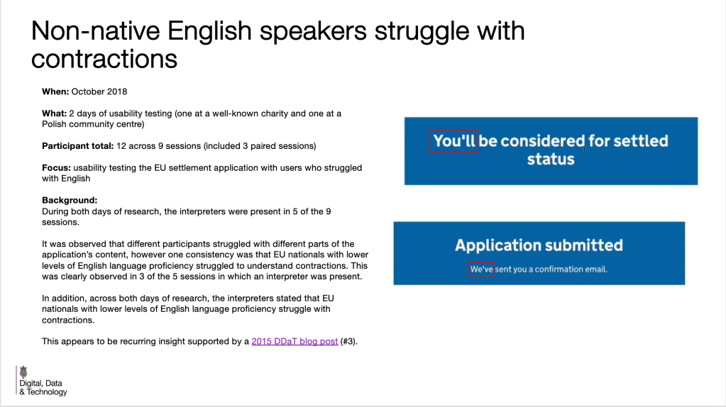
- contractions were not easily understood and led to a change of style for the Home Office
I worked closely with the interaction designer. We:
- added graphics to screens to help applicants to understand their existing immigration documentation
- wrote help and hint text to help users understand their existing immigration status
- simplified explanations to work for multiple user groups
I removed all the contractions and presented our user research and private beta findings to the Home Office User Centred Design team and content designers. This led to a change of Home Office style.
The online application service for the EU Settlement Scheme was designed alongside a mobile app.
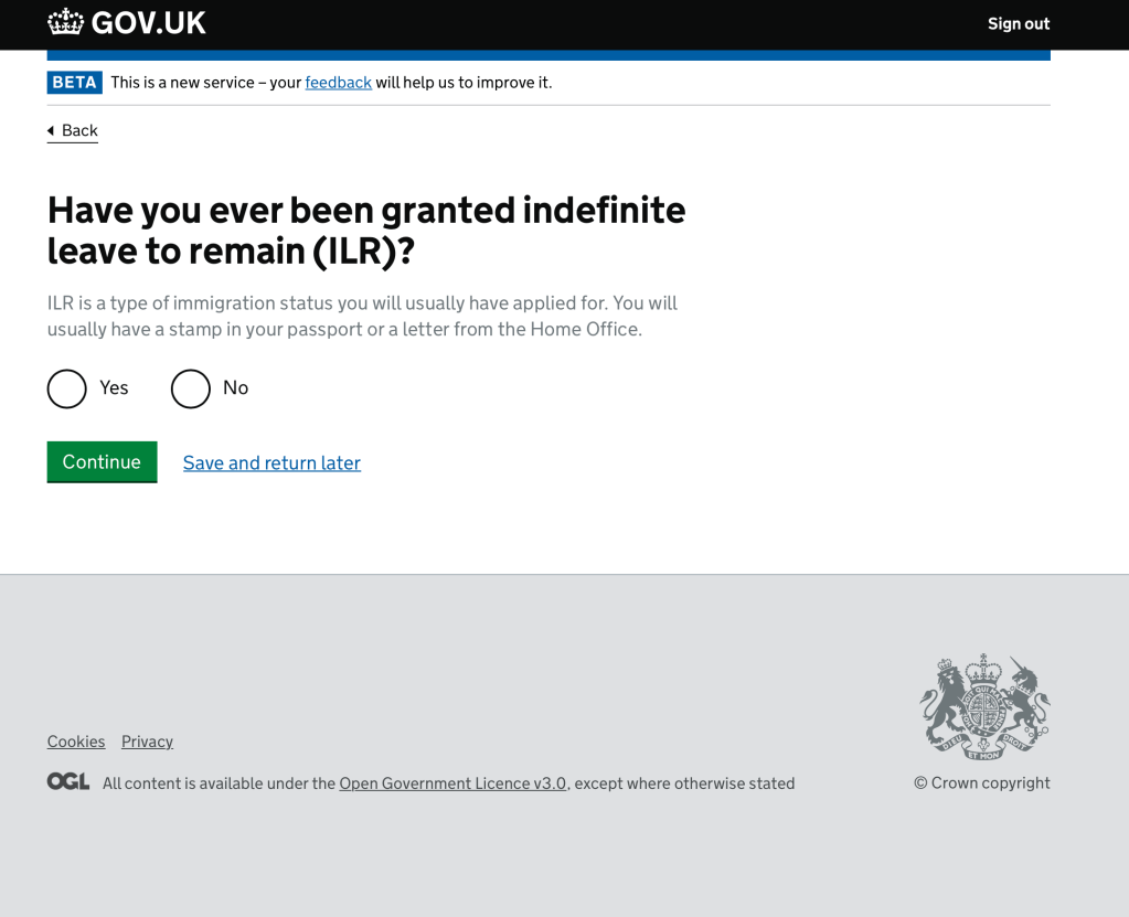
Use of help and hint text
During private Beta we discovered that people did not understand their current immigration status. Each question needed to include text to help them work out what their answer should be.
Using graphics to help understanding
We also discovered during user testing that people did not always know if they had a biometric residence card. Adding a simple graphic of the biometric chip symbol was the simplest and most effective way of showing what they needed to look for on their residence card.

The screen asking the applicant if they had a permanent residence card had originally mentioned the colour of the card and explained that if it was a different colour it was not a permanent residence card. (As we had been told by UK Visas and Immigration.)
But, during the private Beta, we discovered that there were other types of immigration documents in the same colour as the permanent residence card.
We A/B tested a few solutions and found that the graphic with some instructions about where to look on the document was the most successful way of conveying this information.
In the H1 we asked if the applicant had a “document certifying UK permanent residence” rather than a “permanent residence card” because not every document certifying permanent residence was called a “permanent residence card”. In testing we found that this question along with the instruction to answer ‘no’ if it said ‘Registration certificate’ helped to make sure that the applicant did not answer incorrectly. An incorrect answer could have meant that their application would be thrown out and they would have to apply again.

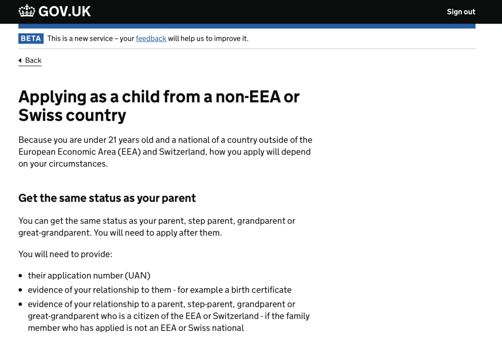
Simplifying explanations for multiple user groups
Sometimes it was necessary to have a lot of explanation to direct applicants to the correct path in the application process.
This screen served as a type of start page for applicants who were under 21. We wanted to help them gather together the documents they would need before they continued with the application.
We were aware that a lot of applications for children would be done by someone else. But to avoid complicated and overly long sentences saying “If you are applying on behalf of a child, or if you are under 21 and applying for yourself, you can…” we stuck to addressing the child as if they were the filling in the application. People applying on behalf of a child understood the information.

Changing Home Office style on contractions
During user testing with users who had a low proficiency in English language, we discovered that contractions were not easily understood by those users. Using contractions such as “we’ll” and “you’ve” was a GOV.UK content style at the time. This discovery led to a change of Home Office content style.
This is a screen from a presentation I gave to content designers in Digital Data and Technology (DDAT) at the Home Office.