I was brought in to improve and iterate this web app which had originally been designed without content design support. I worked with a product designer, behavioural scientist and product owner.
The challenge we faced was that the users were using the app while also taking physical measurements, blood samples, asking questions and engaging with another person.
The improvements we made tested well.
- Using my knowledge of content design best practice, I changed the H1s to questions and instructions — they had previously been titles with instructions underneath. This reduced the clutter on the screen and the phlebotomists could see at a glance what they were doing next.
- We merged several screens into one screen for ease of use while taking and recording physical measurements.
- We changed the order of the screens to help the phlebotomists conduct the appointment more efficiently.
- I worked with the Science Team to improve the question we were asking about when the participant had last eaten — to get the best data and avoid confusing both the phlebotomist and the participant.
- I used my knowledge of content design best practice and previous experience to change the confirmation page to reassure users that they had submitted the data they had collected.
- We rewrote and redesigned the validation error messages using the GOV.UK pattern to help users to recover from validation errors.
About the app
The Clinical Staff Application is used by phlebotomists and other staff from external suppliers to run face-to-face appointments. Phlebotomists take and record blood samples, cholesterol readings and physical measurements. They also record answers to questions they ask the participants.
Our Future Health’s mission is to collect blood samples and health information from 5 million people for use by medical researchers.
We researched and tested with the external partners’ staff. We liaised with the:
- Programme Operations Team
- Science Team
- external partners
The app needed to:
- meet business needs
- gather data for future use by medical researchers
- be as easy to use and efficient as possible for phlebotomists conducting a face-to-face appointment
Improving H1s
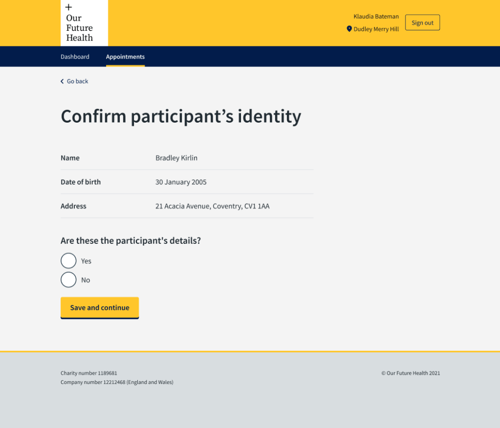
One of the first things we had to do was improve the H1s to give instructions to staff. They had previously been written as titles, with the instructions in additional text beneath the H1. This made for busy screens which slowed the users down.
In this example, the phlebotomist needed to confirm that the person who had come into their bay was the person they were expecting from the waiting area. There are sometimes several phlebotomists working in the clinics, so it was possible for someone to go to the wrong bay when their name was called. I worked with the product designer to improve this screen, include the participant details to check, and simple ‘yes, no’ radio buttons to confirm identity.
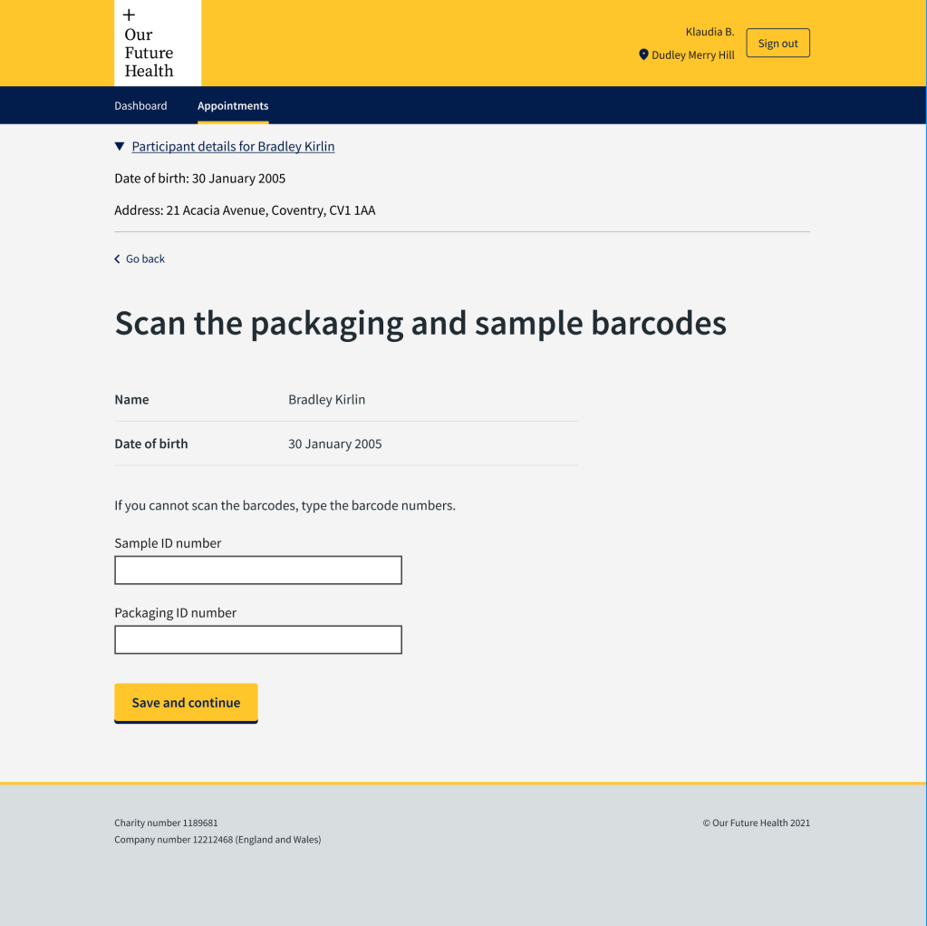
In this next example, the H1 had told the phlebotomist to “Enter the packaging and sample barcodes”. The kit the phlebotomists were using included a scanner to scan the barcodes. They only needed to enter the barcodes manually if the scanner did not work. The previous H1 was causing some confusion and they were typing the barcodes instead of scanning them. There is less possibility of an error if barcodes are scanned.
Improving efficiency of appointments
Our Future Health wanted each appointment to take a maximum of 20 minutes. We worked with the external suppliers to interview the phlebotomists, understand how they worked and how we could help them.
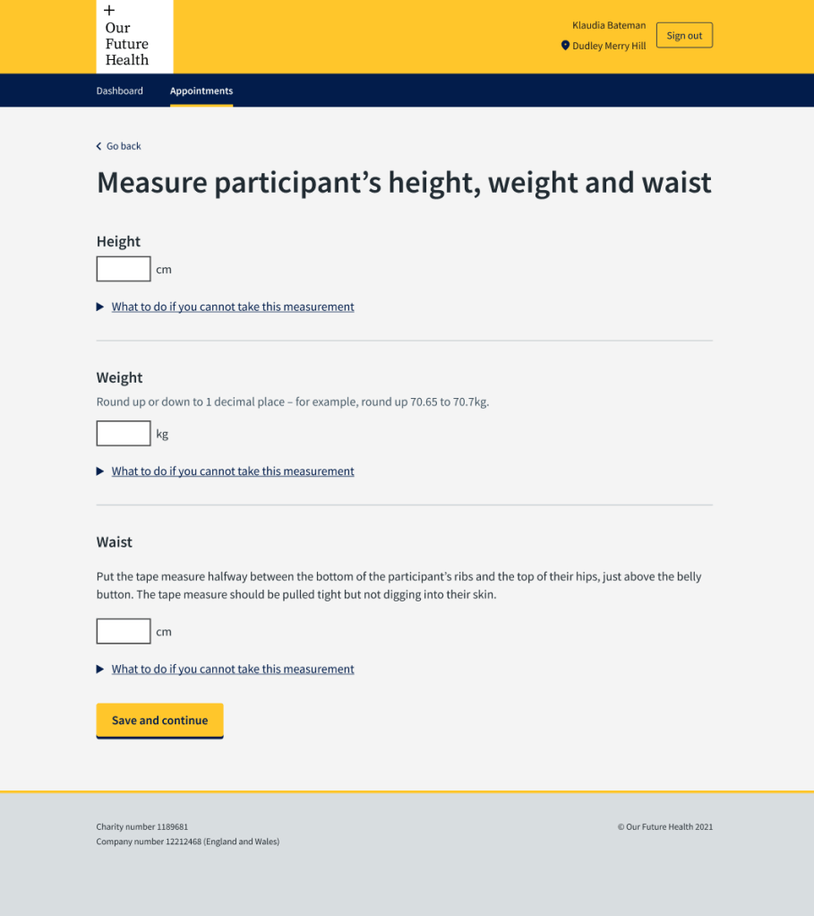
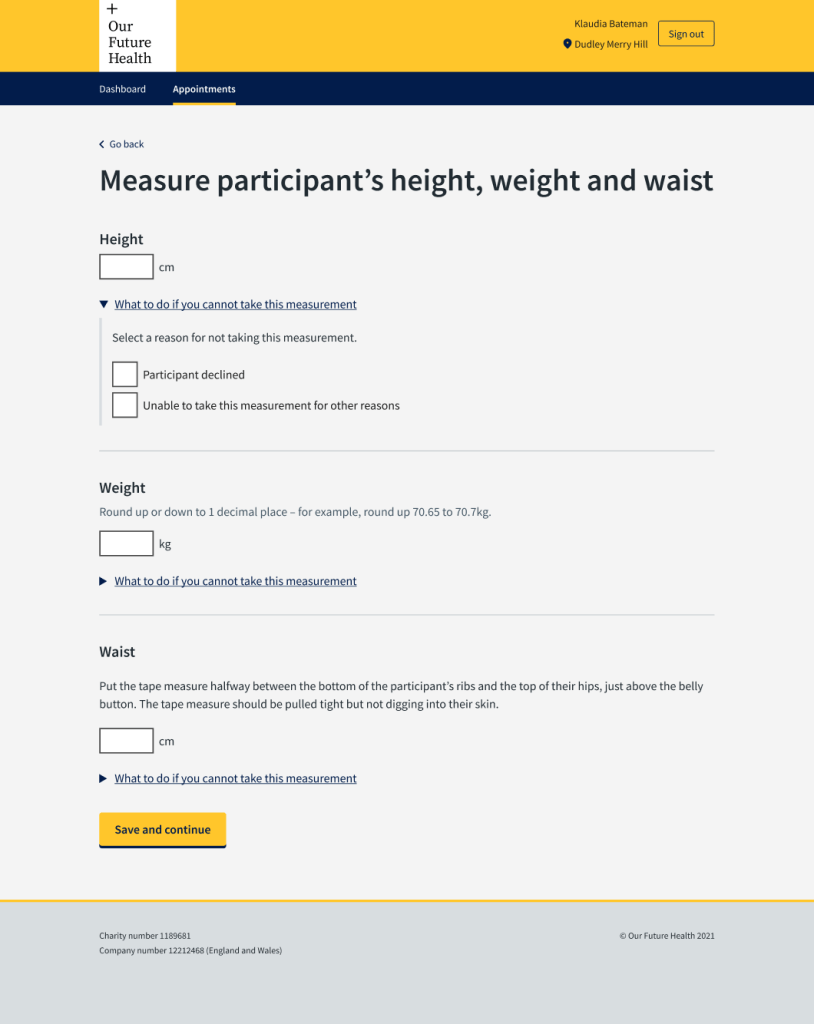
One issue that came up was that the order in which they took the physical measurements, depended on their own and the participant’s preferences. They had to measure height, weight and waist. The height measure and scales were one piece of equipment and they took the waist measurement while the participant was standing, getting on or off the scales.
Each measurement had previously had a separate screen to enter the results. This meant the phlebotomist had to toggle between them if they were not in the order in which they were taking the measurements or write them down on paper and enter them later – sometimes after the participant had left the bay.
We put everything on one screen which made the appointment more efficient and easier for the phlebotomist. It also reduced the chance of mistakes with staff forgetting to put in measurements they had written down or relying on entering things later.
This screen tested very well with the phlebotomists.
The app had to be part of the conversation
One of the most important considerations for medical researchers using the blood samples, was to know when the participant had last eaten something that might affect blood lipids.
I worked with the Science Team to work out what question we needed to ask the participant. We discussed how we could ask a question to get the most useful answer without adding lengthy explanations and asking them to estimate how much fat was in a drink. We settled on a meal and not a snack.
The previous screen had asked “How long ago did the participant last eat?” In interviews, the phlebotomists told us that participants would tell them the time they last ate and the phlebotomists had to work out how long ago that was. This was an additional task for them, and could lead to mistakes.
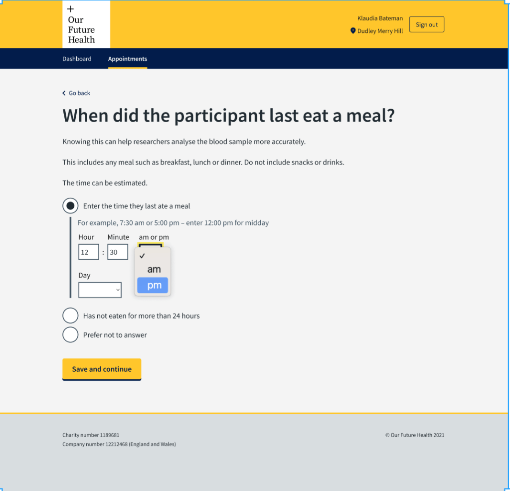
We decided they should enter the time of the last meal on the screen and the system would work out the difference in time from the appointment time.
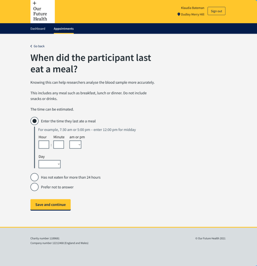
Because the phlebotomists were entering the results of a conversation, we designed the screens so that they could enter the time in using a 12-hour rather than 24-hour clock. People typically speak about time using morning and afternoon or evening. Asking phlebotomists to change that to 24 hours could introduce mistakes, for example 7pm being entered as 17:00.
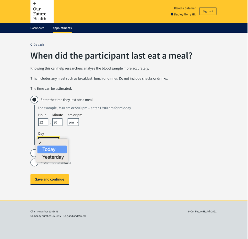
We also needed to know the day they last ate. Most people would have eaten within the last 24 hours, so we designed the screens to give the options ‘today’ and ‘yesterday’. There was an option of ‘Has not eaten for more than 24 hours’ for the outliers.
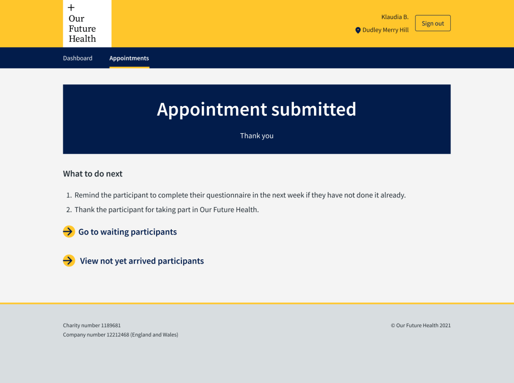
Reassurance for users
I persuaded the product owner that we needed to rewrite the content in the final screen. It was originally quite wordy and emphasised thanking the phlebotomist. I suspected that they would prefer to be reassured that all the data they had entered had been successfully recorded.
We changed the screen and it tested very well. The users appreciated the reassurance that everything had been received.