
I worked closely with an interaction designer, developer and product owner to design and build this digital service on GOV.UK in 4 days. We had a further 2 days to iron out bugs and mistakes in the design and build.
- I took a huge and confusing spreadsheet that the Cabinet Office had been sending out and reduced it to a much smaller number of screens and questions.
- I worked with the stakeholder to understand which questions were absolutely necessary and which could be asked when they contacted the organisation after they registered.
- Using content design best practice, I turned complicated questions into simpler questions with help text.
The service and screens
The service was created to register businesses and organisations so that they could continue to get funding for research and development from the UK government after Brexit.
These screenshots show question flows. The information that the UK Government’s Cabinet Office needed was contained in a spreadsheet.
We made good use of GOV.UK Design System patterns to design and build the screens quickly.

Bringing questions together on 1 screen
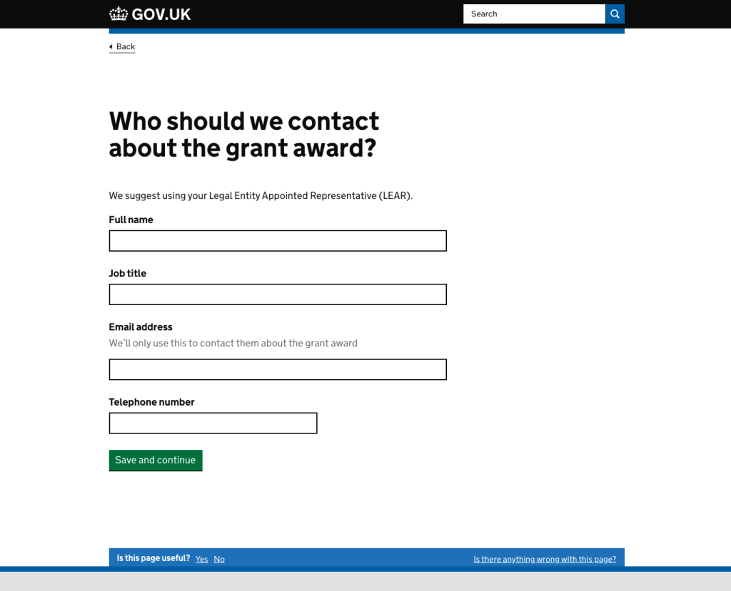
We had to ask for if the organisation was a registered company or charity and get the number if they were. The easiest way to do this was to ask for a number and offer a ‘yes’ or ‘no’ radio button selection. If the user answered ‘yes’, the field to enter the number appeared.
This brought together a number of separate questions about company numbers and charity registration numbers.

The next screen has the same pattern.
I could not add hint text to help the user enter the number in the correct format because there was too much variety in the number formats. The Cabinet Office team had to contact everyone who registered, so numbers could be checked later and rectified.

Deviating from the GOV.UK patterns
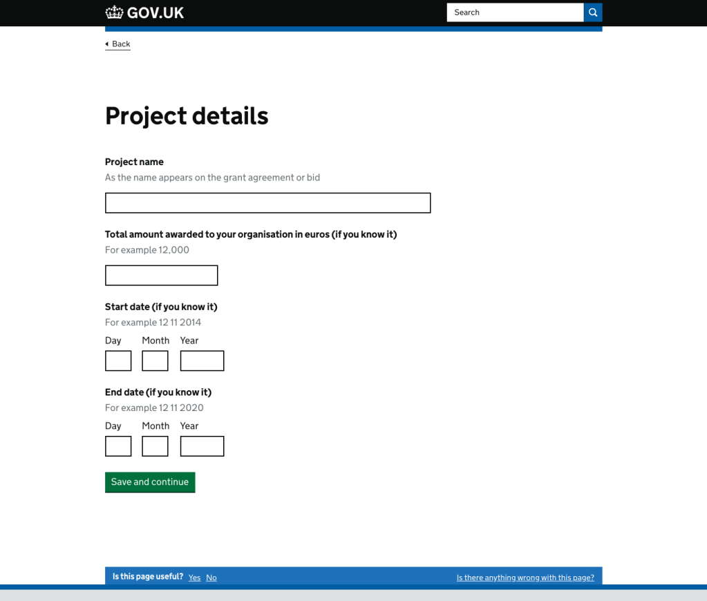
When asking for project details, we were told that the people filling in this form may not be the same people who applied for the grant in the first place. They might not have all the answers. It was important for the Cabinet Office to get organisations to register by the deadline. And because they could contact the organisations once they knew who they were, it was more important that organisations did not miss the deadline because they were trying to get all the details.
I added “(if you know it)” rather than “(optional)” because the information being asked for was not optional – it just was not crucial to enter it at this point.
What I would have done differently
With more time, I would have pushed back even more on the need for some of the information being asked for — particularly because those registering would be contacted for further information. We would also have tested with users.
Featured image photo by omid armin on Unsplash
